Thursday, 4 September 2014

Cheap food, cheap design.


I have always been a value range shopper. Really, how much better can a 86p can of chopped tomatoes be than a 19p can? I don't really care that much abut the packaging either, even as a designer. However, this isn't the case for everyone.


Most supermarket's 'value ranges' main selling point is that they undercut named brands. I think throughout time they've persuaded themselves that to show this price drop they must have horribly plain and somewhat utilitarian designs. This started decades ago with Kwik Save's 'No Frills' brand. It even says it in the name. "Yes, you can have this can of beans for 7p but you also get this black and white label that tells the world how cheap you really are". This advertisment of your wealth puts some people off buying value ranges.

So why can't value ranges have some charm and engagement? Even 7 year old Harry Deverill spotted this marketing flaw. In the metro this week, it described how when eating his breakfast he asked his dad why his Brown sauce label looked so boring. His dad told him to write to Waitrose and to their amazement they wrote back saying that they completely agreed and would now be featuring Harry's own design.

That's why when Coley Porter Bell redesigned Morrison's value range in 2010 I was really impressed. The agency's research showed that consumers are embarrassed of having value products in their trolley. They hoped that the bright colours, comical illustrations and bespoke type-face would add an element of fun and I think they've done an amazing job. The new labels are so far removed from all the bland brands of years passed. It still looks plain and its consistency helps shoppers to identify that it is part of the value range but it does it while looking inviting and inspiring to the consumer.


Wednesday, 3 September 2014

Unexpectedly nice typography from KFC


Ahead of its 50th anniversary, KFC has launched this lovely new marketing campaign to promote their slow cooked, original BBQ chicken. Just about everything from this campaign screams 'trendy'. The distressed chalkboard typography, the south-american music and the summer feeling photography. Even the product itself is in fashion because these days you can't be an 'on-trend' restaurant unless your meat is 'pulled' in someway. Louise Direito, KFC innovation manager says "If pulled pork was the dish of 2014, then 2015 will become the year of pulled chicken. Influenced heavily by both our Kentucky heritage as well as the UK street-food scene, the new range is a labour of love for us." The video featured on the website is also current. The southern-American voice over, plot and hazy style is very reminiscent of the iconic Jack Daniels marketing.

The typography is very similar to recent McDonald's advertising campaign illustrated by Alison Carmicheal. I suspect that the Jack Daniels homely southern roots focus and the McDonald's new focus were key inspirations for this campaign.


It almost seems too cool and trendy for KFC, I love it because I'm a designer but will their die-hard fans feel the same way? I believe it is a bid to draw in new crowds by improving the variety of their menu and bringing it more in-line with current tastes of the 'new generation' market. In that sense I think this campaign works because it speaks to that new audience very effectively.

The responsive site design also looks top-notch and works flawlessly. See the full website here: www.kfcpulledchicken.co.uk/

Monday, 5 December 2011

Triangle matching

I completed my first large scale screenprinted fabric tonight. It was tense. There were four beds and three people which, after I damaged my first emulsioned screen, left me a mere hour to accurately line up thirteen A4 designs, twice. Unlucky for some, thirteen actually worked for me, but I didn't dare push it and attempt a second colour.

I did try the 2-colour on my A4 fabric sheets and it came out really well. Just a shame that the material is so thin and translucent, it will be difficult to sew neatly!

Any of my friends reading this may be receiving a triangle themed Christmas present. Geometric iPhone case anyone?


Friday, 2 December 2011

Misfits at Fruity

For the Channel 4 Misfits arrival at Fruity this November, we thought it would be fitting to give away 100 boiler suits. They are modelled on the suits they wear in the show but, of course, with a Fruity style twist!

Tuesday, 23 November 2010

Little people

http://little-people.blogspot.com/

amazing!

Saturday, 23 October 2010

The changing face of advertising

I was lucky to attend a creative networking lecture this week by Patrick Burgoyne, the editor of creative review. I was excited to see what the lecture would be about and was surprised that the topic of the lecture was exactly the same as my proposed dissertation topic. My question is: What implications des the instantaneous nature of social media have on brands which want to develop their identity? In particular, is the recent Gap campaign an example of how companies are trapped into never updating their current identities?

When researching my dissertation it is clear that if the consumer purchases branded products over commodity products they are probably buying the brands image, values and beliefs. If the brand changes, seemingly to the consumer overnight, then they will be instantly shocked by the abrupt change. This will in turn, create strong emotions. They were perfectly happy with the brand identity before, and they saw no reason to change the logo so why have they? Thousands of people jump to the conclusion "I could have designed that myself in Microsoft Word" This I doubt, i'm a graphic designer and I struggle to even move images in Word.

The consumer has become increasingly demanding with the increase of choice in the market. They expect a lot from global brands and importantly, they expect their opinion to be valid. Should Brand managers take into consideration the consumers instant reaction and stop the brand development (like Gap) or ignore the uproar and trust that their design is strong enough to ultimately improve the brands sales?

To answer this question we have to ask ourselves, is it a successful identity change or not? If we look back at Consignia (this was what the Post Office re-named itself in 2002) Market research showed that the consumers hated it, and most didn't know that Consignia was even part of the post office at all. This is probably the most important part of a re-brand, that the customers know the re-brand actually took place. TV shows jumped on the re-brand and recorded the audiences reaction and eventually the Chief Exec decided to scrap the name. If social media and blogging was around I doubt it would have taken over a year to make the decision to scrap it. It wasn't a successful rebrand.

I tried to find an example of when a re-brand has had initial hatred but eventually succeeded and a perfect example is the Guardian re-brand. There was mass outcry at how awful it was and how much of a shame it was to loose the traditional design for the new modern edition. Are audiences just reacting to the initial shock of a brand image change?

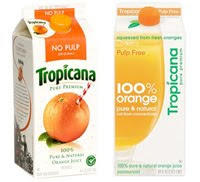
Bloggers loved the Herbal Essences re-brand and their sales increased by 20%, but they hated the Tropicana rebrand and they lost 20% of their sales. It seems obvious but these opinions are the opinions of the customers, so surely, Brand managers should have online reaction factored into their development plans? But what if the audiences are just shocked and can't see the future positive aspects of the change? Should Brand mangers be transparent about their plans to re-brand?

With the invention of online social networks it has become clear that there is a new need for companies to manage the consumer reaction to a re-brand more effectively online. I hope to answer this in my dissertation... watch this space.

Saturday, 9 October 2010

baa baa black sheep


Love the what the flock campaign... its worked so well! Really intriguing, everyone was talking about it. It proves how shocking the fact that only 17% of students have used Cannabis in the last 3 months is to other students. It will hopefully make students think twice about using it if there immediate thought isn't "well, everyone else is doing it so why shouldn't I?" Its had its first positive mention in Creative review this week too.

Thackray museum

I recently visited the Thackray museum. It describes the history of medicine and Leeds and has many areas you can explore. I'd definitely recommend going! The best feature was the free-to-explore life like street where you can find more about your chosen character and what their life was like in the 1800's. You then travel into the medicine room to find out of your character can afford the medicine that will cure them. I really recommend it but maybe it is a little to gruesome for children, especially, the room that shows you what happens to 11 year old annie whose leg gets caught in a mill machine (they saw it off with no anaesthetic).

Friday, 1 October 2010

More Moorcroft please!

Over the summer I took a real interest in my family history, I found that most members of my family have at some point worked with pottery until the rapid decline of the industry in recent years. I visited the Moorcroft museum to find out more about the industry and was pleasantly surprised by the design of the products. It is way out of my price range but will definitely be on my wish list. My favoutirte is this piece by Kerry Goodwin depicting the Potteries in Recession. It shows a rain covered scene where the potbanks are closing, and relates closely to my families history with the industry. The colours are amazing.

From streets to tweets

Chris Osburn (Juxtapoz magazine) recently did a talk at Yorkshire creative networks event on 'streets to tweets'. He is a professional photographer based in London who photographs graffiti artists work and sells the photographs. This was seen to be quite controversial with some members of the audience, mainly the graffiti artists. The main question that Osburn put forward was: is the photograph adding to the image or taking away?

He argued his point with the photograph he took for graffiti artist Sickboy. Sickboy uses the image on his promotional material. He claims that his creativity arises from the way he takes the photograph. In this instance the girls add to the image as it depicts how audiences interact with the image. Is this an artform? The graffiti artists would say not. They claim that he is cashing in on others art and using the fact that the art is illegal and they can't make money from it to cash in himself.

However, the street artists are aware that they produce art that can't make money and will be removed, so is it fair for them to scrutinise people taking photos if it is in such a public place? Probably not, even if those photos make the photographer money.

Monday, 27 September 2010

MAN CRISPS

http://www.mccoys.co.uk/

McCoy’s has launched a brand new website their crisps. They are targeting their products at 'real men', calling the crisps 'the ultimate man crisps'. The website has been designed around an interactive pub targeting male consumers. They use humorous and engaging elements to raise brand awareness of the crisps. The website includes a 'Man Quiz' for men to test their manliness. The website is beautifully designed and so interactive that it makes you want to stay on the site. Although are thy cutting out half their market by not including women? Maybe they should have a section, even if it was a small section, which could include women in the campaign.

Wednesday, 22 September 2010

Marmite - love it or hate it

Marmite - love it or hate it, the same goes for the advertising camapign. Marmite have released spoof adverts of the brand branching out into new ventures. The campaign features all of Marmites most shocking product ideas, including a fabric softener, a shower gel and a perfume.

The ads, created by DDB UK, are not actual products which will be released although the campgin is selling a new Marmite Cereal Bar. It will be the world's first savory cereal bar. The ads tell you to tell you to log onto their facebook page and tell them if you love them or hate them.

Wednesday, 15 September 2010

Impressive flash portfolio design

Beautiful illustration by Rowan. Lovely way to present your portfolio online.

www.rowanimation.co.uk

Tuesday, 14 September 2010

Monday, 13 September 2010

Google ball game


http://www.pcworld.com/article/204923/whats_up_with_googles_bouncy_ball_logo.html?tk=hp_new

Friday, 10 September 2010

Pottery town

In my family's hometown of Stoke-on-Trent, there is an amazing pottery heritage. I recently visited the Clarice Cliff pottery museum. It was brilliant to explore my home town's vast history and visit the museum of a designer whom I adore. The shapes and designs of her pottery were the most unique of its time and still are today. It is undisputed that Josiah Wedgwood is the biggest Legacy in Britain's pottery industry but for me Clarice Cliff is by far the most creative.


Dinner for schmucks


After seeing the advert for this film I didn't really have high hopes for it. I expected the scenes to be limited to a dinner table and the comedy to be predictable.


I was pleasantly surprised.


I thought the comedy was exceptional. Very simple, silly kind of humour but I thought Steve Carell's role was perfect. The all-star cast starred not just American comedians but British too. It had Steve Carell (American Office), Chris O'Dowd (I.T crowd), Paul Rudd (Friends), Zach Galifianakis (The Hangover), Jemaine Clement (Flight of the conchords), David Walliams (Little Britain) and Kristen Schaal (Flight of the conchords). Before the film I thought that the film would end up being a battle for stardom, but the roles worked exceptionally well together.


My favourite thing about the film were the opening credits. The credits waa beautifully shot following a taxidermist creating and placing designs of two mice that are in love. The mouse scenes are magical and made the opening credits beautifully captivating. The song The Beatles "the fool on the hill" plays so suitably over the scenes that it would seem you were watching a romance film.


Thursday, 9 September 2010

Paper pictures

CHRISTIAN HÜCKSTÄDT


I Really admire these wonderful pictures. All of Huckstadt's pieces are created from colourful cutout cardboard. They are fun geometric creations with an unique look and stunning 3D effect.

Monday, 6 September 2010

The secret Leopard

In my family's hometown of Burslem, the mother town of Stoke-on-Trent, there is a wonderful heritage which can be found in many of the town's buildings. Burslem's town centre pub the "Leopard hotel" serving since at least 1765 was a local for my great-great grandmother, my great grandmother, my Nan and my Dad. The hotel is steeped in history boatsting that Britain's greatest pottery producer Josiah Wedgwood and James Brindley met here to discuss building the Trent and Mersey Canal in 1765. This was a large stepping stone for the industrial revolution.The Leopard hotel has an amazing secret.

Recently the pub rediscovered FIFTY hotels rooms which had been bricked and wallpapered up and left completely unused since 1951. They also found 19 underground tunnels which led to other of the town's landmark building's including the town hall and the local brewery. The hidden gem unveiled wonderful photos of the rooms which reflect the style and decor of the 1950's.

I've visited the hotel on a number of occasions and would have never guessed that the rooms ever existed. It makes you wonder what else you can easily miss!


the oldest building in Leeds City centre

Lambert's Yard, the oldest building in Leeds City centre. It is just off Briggate. This is not what I pictured the oldest building in the City to look like! It was built in around 1600 and is the last three rise building in the city. The photo's are old and new captures of the building.