Showing posts with label branding. Show all posts

Thursday, 4 September 2014

Cheap food, cheap design.


I have always been a value range shopper. Really, how much better can a 86p can of chopped tomatoes be than a 19p can? I don't really care that much abut the packaging either, even as a designer. However, this isn't the case for everyone.


Most supermarket's 'value ranges' main selling point is that they undercut named brands. I think throughout time they've persuaded themselves that to show this price drop they must have horribly plain and somewhat utilitarian designs. This started decades ago with Kwik Save's 'No Frills' brand. It even says it in the name. "Yes, you can have this can of beans for 7p but you also get this black and white label that tells the world how cheap you really are". This advertisment of your wealth puts some people off buying value ranges.

So why can't value ranges have some charm and engagement? Even 7 year old Harry Deverill spotted this marketing flaw. In the metro this week, it described how when eating his breakfast he asked his dad why his Brown sauce label looked so boring. His dad told him to write to Waitrose and to their amazement they wrote back saying that they completely agreed and would now be featuring Harry's own design.

That's why when Coley Porter Bell redesigned Morrison's value range in 2010 I was really impressed. The agency's research showed that consumers are embarrassed of having value products in their trolley. They hoped that the bright colours, comical illustrations and bespoke type-face would add an element of fun and I think they've done an amazing job. The new labels are so far removed from all the bland brands of years passed. It still looks plain and its consistency helps shoppers to identify that it is part of the value range but it does it while looking inviting and inspiring to the consumer.


Wednesday, 3 September 2014

Unexpectedly nice typography from KFC


Ahead of its 50th anniversary, KFC has launched this lovely new marketing campaign to promote their slow cooked, original BBQ chicken. Just about everything from this campaign screams 'trendy'. The distressed chalkboard typography, the south-american music and the summer feeling photography. Even the product itself is in fashion because these days you can't be an 'on-trend' restaurant unless your meat is 'pulled' in someway. Louise Direito, KFC innovation manager says "If pulled pork was the dish of 2014, then 2015 will become the year of pulled chicken. Influenced heavily by both our Kentucky heritage as well as the UK street-food scene, the new range is a labour of love for us." The video featured on the website is also current. The southern-American voice over, plot and hazy style is very reminiscent of the iconic Jack Daniels marketing.

The typography is very similar to recent McDonald's advertising campaign illustrated by Alison Carmicheal. I suspect that the Jack Daniels homely southern roots focus and the McDonald's new focus were key inspirations for this campaign.


It almost seems too cool and trendy for KFC, I love it because I'm a designer but will their die-hard fans feel the same way? I believe it is a bid to draw in new crowds by improving the variety of their menu and bringing it more in-line with current tastes of the 'new generation' market. In that sense I think this campaign works because it speaks to that new audience very effectively.

The responsive site design also looks top-notch and works flawlessly. See the full website here: www.kfcpulledchicken.co.uk/

Monday, 27 September 2010

MAN CRISPS

http://www.mccoys.co.uk/

McCoy’s has launched a brand new website their crisps. They are targeting their products at 'real men', calling the crisps 'the ultimate man crisps'. The website has been designed around an interactive pub targeting male consumers. They use humorous and engaging elements to raise brand awareness of the crisps. The website includes a 'Man Quiz' for men to test their manliness. The website is beautifully designed and so interactive that it makes you want to stay on the site. Although are thy cutting out half their market by not including women? Maybe they should have a section, even if it was a small section, which could include women in the campaign.

Wednesday, 22 September 2010

Marmite - love it or hate it

Marmite - love it or hate it, the same goes for the advertising camapign. Marmite have released spoof adverts of the brand branching out into new ventures. The campaign features all of Marmites most shocking product ideas, including a fabric softener, a shower gel and a perfume.

The ads, created by DDB UK, are not actual products which will be released although the campgin is selling a new Marmite Cereal Bar. It will be the world's first savory cereal bar. The ads tell you to tell you to log onto their facebook page and tell them if you love them or hate them.

Sunday, 5 September 2010

Welcome to Yorkshire

The re-brand of the Yorkshire tourist board produced by Elmwood design is a wonderful example of modernisation. The re-brand was necessary to make Yorkshire a desirable places for many audiences not just people interested in the traditional countryside aspect of Yorkshire. This is truly the identity Yorkshire deserves.

The campaign uses the Y to answer WHY Yorkshire is the place to be. "Discover Y" works on two levels the question (whY) and the answer (Yorkshire). A very clever and complete concept. Local newspaper Yorkshire post used the headline "Yorkshire tourism ready to show the world Y" which was a beautiful way of forwarding Elmwood's concept for the brand.
Before and after logo designs for the Yorkshire tourism department.

Thursday, 2 September 2010

Regulating social media marketing


Social media marketing is becoming increasingly popular with marketers and this has increased the popularity with the bodies governing the marketers.

The Advertising standards authority (ASA) has announced that corporate use for social media will come under the same rules as TV, press poster, radio and newspaper ads. The ASA has stated that it has "protection of children and consumers at its heart". The decision was made after they received over 4,500 complaints from the public which they could not deal with as it was not in their responsibility.

The new rules will come into effect 1st March next year. The ASA will regulate marketing in all areas of digital marketing, including the company’s own website and microsites. More attention will be given to social media marketing on sites such as Facebook, MySpace or Twitter. The new rules will mean that all online marketing will have to be responsible, legal, honest and truthful. They will concentrate on adverts which sell products rather than ones with editorial content.

Sunday, 22 August 2010

Paper wow

Absolutely gorgeous style produced by Robert Ryan. His brand is extremely recognisable and his techniques truly unique. All of his works are cut into paper then scanned or photographed to produce an individual way of presenting work. I LOVE the shop design and would happily cover my whole house in his fascinating and adorable pieces.

Wednesday, 18 August 2010

Book adverts on TV (bad ones)

It isn't often that you see book adverts on TV. Unless it's a collection of books from WHSmith or Jordan's new autobiography. So when an advert for James Patterson's book collection appeared at primetime tonight this made me think how strange it is and notice the considerable gap in the market.

When I looked into Patterson I found out that he used to be in advertising, which explained a lot. Unsurprisingly, he was the chairman of America's largest advertising agency, J. Walter Thompson. I found that he ferociously scrutinises the designs of his book jackets and pours money into his marketing campaigns out his own pocket.

So why aren't book adverts rife on TV? In 1992, Patterson's own publisher refused to fund a TV advert which shows how adverse the industry is to TV advertising. As an advertising genius he can clearly see the benefit of advertising to a mass medium which the book industry does not. He went on to fund his own advert and the book was so successful that it has now been transformed into two films starring Morgan Freeman.

But even with all the experience Patterson's campaign is a collection of pretty awful Americanised adverts. They make me cringe....


Find more videos like this on The James Patterson Community

Sunday, 10 January 2010

How will Cadburys branding be affected by a Kraft take over?

The battle of for the acquisition of Cadbury continues this week into the run up for the last bid from Kraft. Kraft’s hostile bid was rejected and they had until January the 19th to come up with a better offer. Kraft’s offer values Cadbury at 740p per share where as British investors say the company is more likely to be 850p. However on Krafts side Warren Buffett, their largest investor, has warned the companies CEO not to overpay for Cadbury.

In this time Cadbury has to find a way to avoid being taken over by the U.S Company. The chairman, Roger Carr, can use the companies decreasing share price to repeat his stance that Kraft is a low-growth company and not offering what Cadbury is worth. Todd Stitzer, Cadbury’s chief executive, said they would rather to be acquired by Hershey or Ferrero, than to Kraft, because of their cultural similarities. It seems the mergering of these two companies will see what Kraft has to offer on the 19th before showing their hand.

Many British people have raised their concern that Cadburys will be sold to an American confectioner. Lord Mandleson was concerned that selling Cadburys to Kraft was to make “a fast buck”. He stated “firms or investors should expect to brave the court of public opinion if they are motivated only by short-term profit." And so they did when the Mail on Sunday put together a campaign to keep Cadburys British. Roger Carr, again, showed his similar opinions when he personally thanked MoS readers for their appreciation of “our great British heritage, our products and the values that remain at the heart of our business”. It seems the bid will have nothing to do with share prices on the 19th as even Carr has said he wished for Kraft not to ‘steal’ the company from their shareholders and describes them as under ‘siege’. This campaign seemed to work for advertising on the run-up to Christmas as demand for tins of Roses and Heros soar to record levels. It seems the British public are in great fear of loosing their loved chocolate to an Amercian giant.

Ruth Sunderland of The Observer, believes that “it is important for UK jobs and manufacturing for Cadbury to stay British. Lord Mandelson, the business secretary, has recognised this and indicated he may ask Kraft for detailed answers on jobs, pensions and research capacity. But even investors who dismiss such considerations as irrelevant patriotism must recognise the risks of selling out to Kraft” (Sunday 10 January 2010)

The emotion and love behind Cadbury started with Quakers George and Richard Cadbury when they created a utopia in Bournville for all of its workers. The ethos of Cadbury is to help the while communities and is grounded in Quaker beliefs. Lord Mandelson has said he would not stand by any bid that would not support its heritage. I truly believe that Kraft should be warned of the power of the British people when they feel anger towards a company. The recent take-down of the X-factor number one Christmas song could be repeated for Christmas number on chocolates.

When I have spoke to Family and friends they are worried about two things; jobs in the U.K and the taste of the chocolate. Cadbury has eight factories and 3,000 staff in the UK. It would be harmful to our economy to close these factories and loose precious business in a time of recession. The taste may seem less important in relation to the previous problem, but everyone is afraid that the chocolate will be flavored to suit a more American palette. Cadbury’s Whole nut is available in the U.S sold under Hershey’s however U.K people report of its bitter American taste compared to the creamy delight of U.K chocolate.

What will happen to Cadbury’s branding in the case of an American takeover? British people love Cadburys because it is so British. The adverts are time-keeping and nostalgic to many. Cadbury’s brand is so strong that any product is instantly recognizable as their brand. This cannot be said for Kraft’s products. Terry’s chocolate orange, Toberlone and Oreo are all under the Kraft range and although their brands are strong they are not consistent under the same mother identity.


There is great fear that an American company just won’t get our British heritage. Any potential American CEO should be revising their British knowledge now in preparation for their role if they are going to see any success at all. Mark Artus, CEO of 1HQ, a British branding consultancy, said “Cadbury's values are firmly rooted into the fabric of all that is British and the original Victorian philanthropist approach to giving people jobs."
In the case of an American Take-over I would hate to see Cadbury’s advertising be at all effected. Their classical adverts are British through-and-through and that’s why people love them so much. Decades of adverts create nostalgia and are reminiscent to so many. The Milk Tray men and Cadbury flake women played such a large part in the companies branding that even Cadburys chairman Richard Carr said: 'Our thanks also go to the Cadbury's Flake girls and the Milk Tray men who all contributed to making our products so popular.'

The Milk tray man adverts was one of the most iconic and longest running advertising campaigns in British history. It ran from 1968 to 2003 and featured attractive men modeled on James Bond. They had to complete Action man style moves to get the Milk tray box to their loved ones.

http://www.youtube.com/watch?v=BM4DMe25CvQ


Another well-known advert was the Cadbury’s Caramel Bunny. The animated cartoon vixen told audiences to ‘take it easy’ while being admired for her beauty. The bunny returned in 2003 with the catch phrase “still got it”. She has even been voted the third sexist cartoon character of all time. However, she wasn’t as sexy as the Flake woman who stirred up quite a fuss in the 1970’s for being a bit too raunchy. The adverts showed women enjoying a flake, people complained saying she was enjoying it too much and in a far too suggestive manner. The lyrics were "Only the crumbliest, flakiest chocolate, tastes like chocolate never tasted before."

http://www.youtube.com/watch?v=fpFl_kK0Y88


The Cadburys adverts have taken us right into the 2000’s with their hit adverts for the glass and half full productions. The Crazy eyebrows and gorilla playing drums adverts are strange ways to advertise chocolate and ways in which American CEO’s may not have approved or understood. It would be a shame to loose such a truly British gem in the advertising field to a giant such as Kraft. They were so classical that it was the talk to Britain. An amazing advert that despite its weirdness captivated our country.

http://www.youtube.com/watch?v=JWEOHd9JNmk


Richard Wachman, The Observer, Sunday 10 January 2010
Jonathon Petre, 09th January 2010
Katie Dawson, BBC News, Bournville

Friday, 7 August 2009

The answer to our project - 5 gum??


Our recent, spruce up a mundane product using your advertising and branding skills seems to have been answered. Is this how the gum brief should have been done? If this was entered to our lecturers what grade would it receive?

The first flaw is: its target market. The market has attempted to tempt the MTV segment. In my opinion the packaging resembles your grandfather trying to be 'hip' and 'down'. Im sure with the stark black space and cool bright colors stand out to audience but does it stand out to the right one? There are 3 flavours at the moment: Cobalt, Rain and Flare, which is “cool speak” for peppermint, spearmint and cinnamon.

I can imagine Mike Sheedy saying: "Yes, its good, but what does it do?? What is this gum doing that other gum doesnt?"


Sunday, 2 August 2009

Branson looses virginity


Sir Richard Branson lost his sole use of the word 'Virgin' in branding. Branson has been the only Virgin in town since he started the company in 1970. A south African company named Bodtrade was granted was allowed to use the trademark "You can't be a virgin all your life, its time".

Virgin and no-one even knows what this company does... their are spectualtions it is a shelf company. It is the ONLY time any company has won a branding idea against Branson using the word 'Virgin' except for Olive oil companies. Greedy. Now Branson will be tied up with other companies trying to tag along with Virgins brand identity as others apply to use the word. Virgin are worried that consumers will confuse these products as virgin owned, I'm not so sure.

Bodtrade hit Branson where it hurts costing the company a whopping £1,500 in legal costs.

Monday, 6 July 2009

Woolworths?????

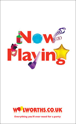
Woolworths... Is the classical chain store back? After seeing Britain plastered with the Woolworths 'Now Playing campaign' I was left confused. I thought this chain store had died during the recession and the 100 years it stood for had ceased? Was this billboard a one off?

Apparently not. I have since seen it everywhere. On TV, magazines, newspapers and billboards around every corner… it has been resurrected. They are undergoing an online renaissance of the high street world under shop direct. So essentially, Shop Direct has taken a strong brand, which could not be saved during the recession and have applied it to their own ideas and concepts of shopping.

Shop direct bought Woolworth’s in February. They boast that over 100,000 people visited in its first 24 hours. Who are you trying to convince Woolies? Most of those visitors were probably drawn in by the same confusion that I was. The collapse of Woolies was front page news, making the brand’s comeback a significant relevance.

The advertisement below is an attempt to grab these news hungry folk, so the simple and confusing advert cleverly works the confusion element. The marketing department obviously want to make front page news again by gripping the audience by the throat.


The cheerful, glowing typography is eye-catching playful and childlike. It represents the party product range and is used to reflect the fanfare associated with the revival of a much loved UK retail icon. The TV advert (link below) Closely follows this new brand identity.

http://www.youtube.com/watch?v=TqhJfry_ifU&feature=player_embedded


So, with closer inspection… Woolies has died and then been reborn into the digital era, forced to live its next century on the internet. But don’t worry, you can still by your pick’n’mix although you cant sneak a few freebies and its now called Click’n’mix.